EMR Reimagined
Electronic medical record (EMR) designs should be intuitive on both ends of care.
UI/UX
Product Design
Redesign
Role
Visual Design
Duration
1 week
Tools
Overview
An electronic medical record (EMR) system is essentially a digital archive of patient healthcare charts, mainly used within a particular medical practice. As someone who works closely with patients, doctors and an EMR software everyday, I wanted to try tackling some of the issues.
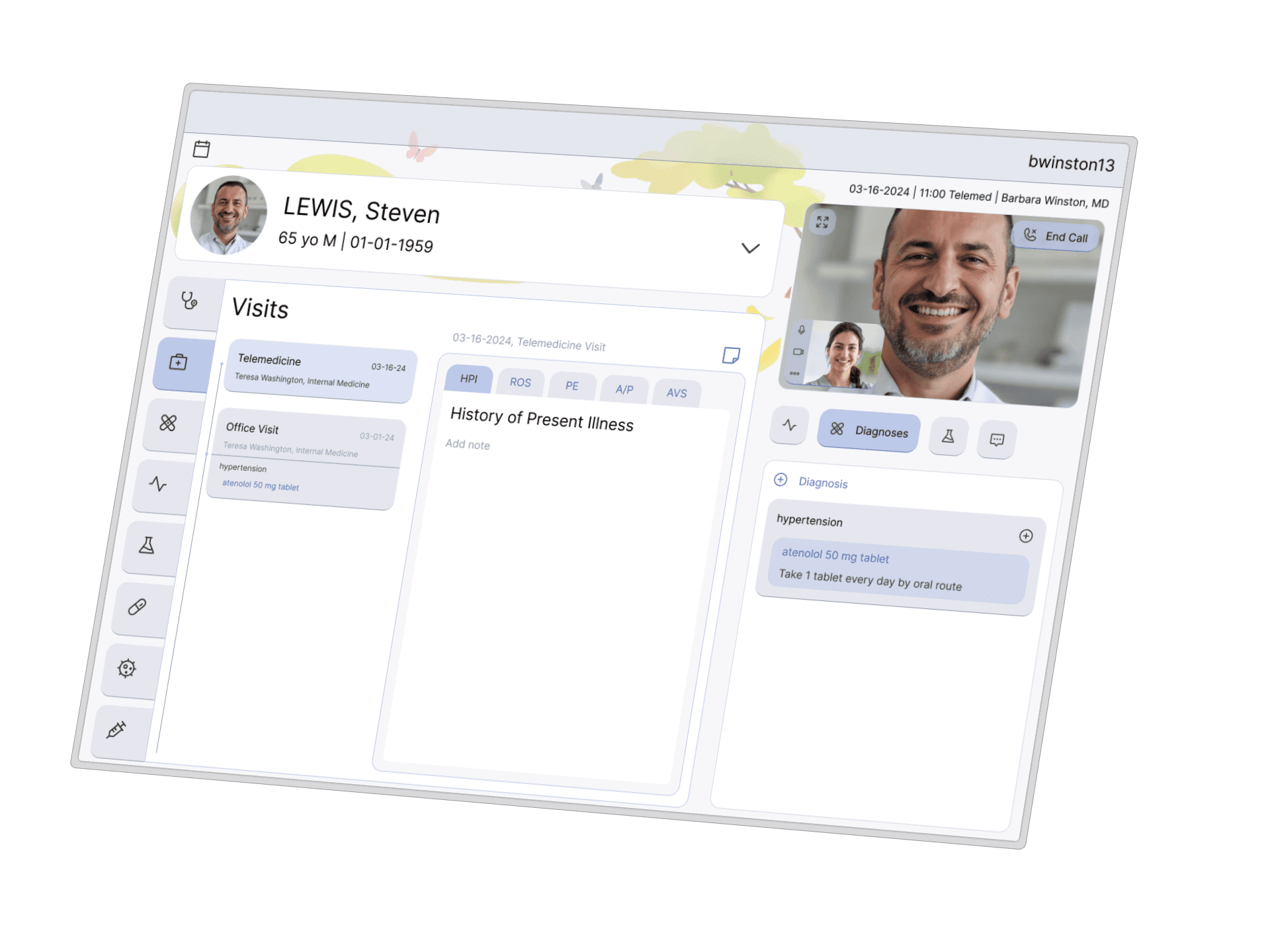
For this project, I reimagined a an EMR interface for a telemedicine visit between a physician and their patient.
The Context
Healthcare systems are extremely complex and information-heavy due to the sheer amount of information and patient data users (i.e., healthcare providers) need to access.
An effective EMR design should ultimately streamline workflows, reduce medical errors, improve patient safety and enhance healthcare delivery.

Design for the Scenario
Design a solution that uses digital technologies to connect patients with healthcare providers for virtual consultations.
User Goals
Patient Needs
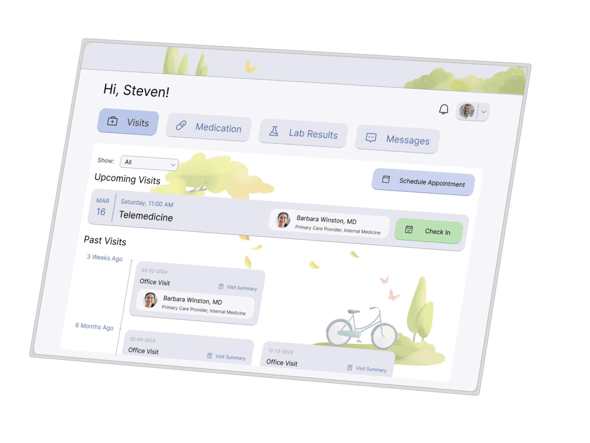
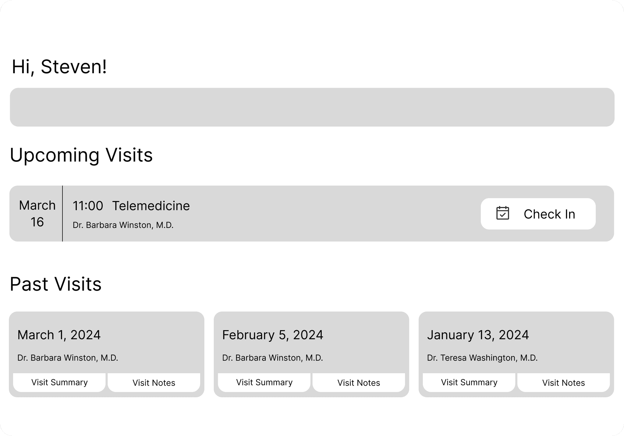
Ability to see previous and future clinical encounters (with summaries)
Remote access to medical professional
Standard video conferencing functionality

Provider Needs
Direct communication with patient
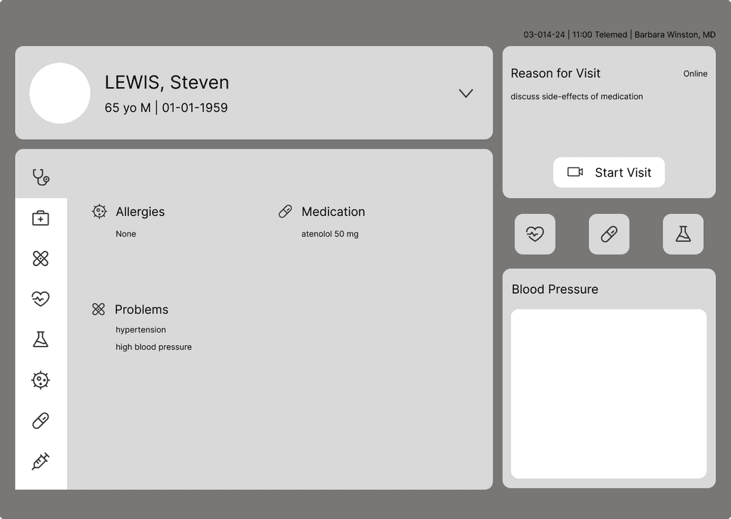
Access to relevant medical data
Ability to adjust treatment to best suit patient's needs
Clinical encounter documentation

Patient
Steven Lewis
65-year-old male
Diagnosed with hypertension/high BP
Daily BP readings are synced with EMR software on his phone
Fairly comfortable with consumer tech, but not an expert
Regularly uses video call services to talk with friends and family
Healthcare Provider
Barbara Winston, M.D.
Primary Care Provider (PCP), specializing in internal medicine
Regularly treats patients for hypertension and is familiar with different treatment options
10+ years EMR experience, only recently started doing telemed
Likes to unplug after using computers all the time for work

Steven experiences symptoms of his new hypertension medication and expresses his concerns to Dr. Winston. They schedule a virtual appointment for the next day, after which Dr. Winston decides to lower the dosage.
Dr. Winston prescribed 50 mg of Atenolol for Steven's hypertension. After 2 weeks of taking the medication, Steven notices he has been having difficulty sleeping, daytime tiredness, and shortness of breath with light exercise. Worried about side-effects, Steven sends Dr. Winston a message on his mobile healthcare app. Dr. Winston schedules a virtual appointment for the next day to discuss the problem together.
The day of the appointment, Steven loads up his healthcare app on his iPad and meets with Dr. Winston who is using the EMR on her PC. After talking to Steven, reviewing his current meds, medical conditions and data from his BP cuff (BP is going down), Dr. Winston decides to lower his dose from 50 mg to 25 mg.

Design Ideas
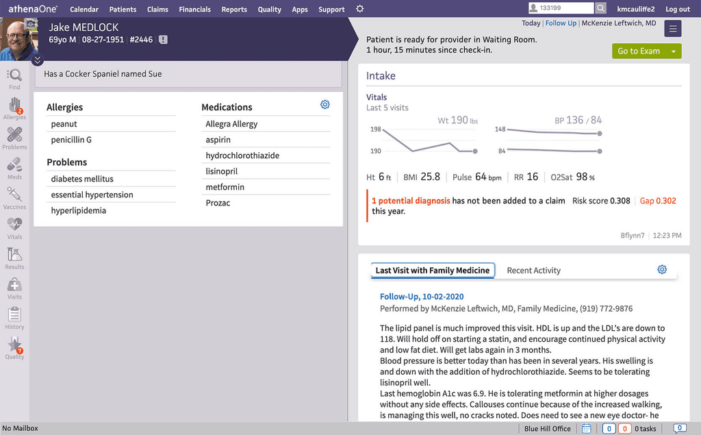
I took a lot of inspiration from athenaOne, as I am familiar with it and personally prefer its UI over other EMRs. Upon watching a couple of demos for other EMR systems, I got a better idea of what elements I wanted to incorporate to minimize friction.
Side-by-side panels for easy information-viewing
Static to dynamic information architecture
Minimize scrolling, new windows/pop-ups and clicks
Low Fidelity Wireframes
Syle Guide
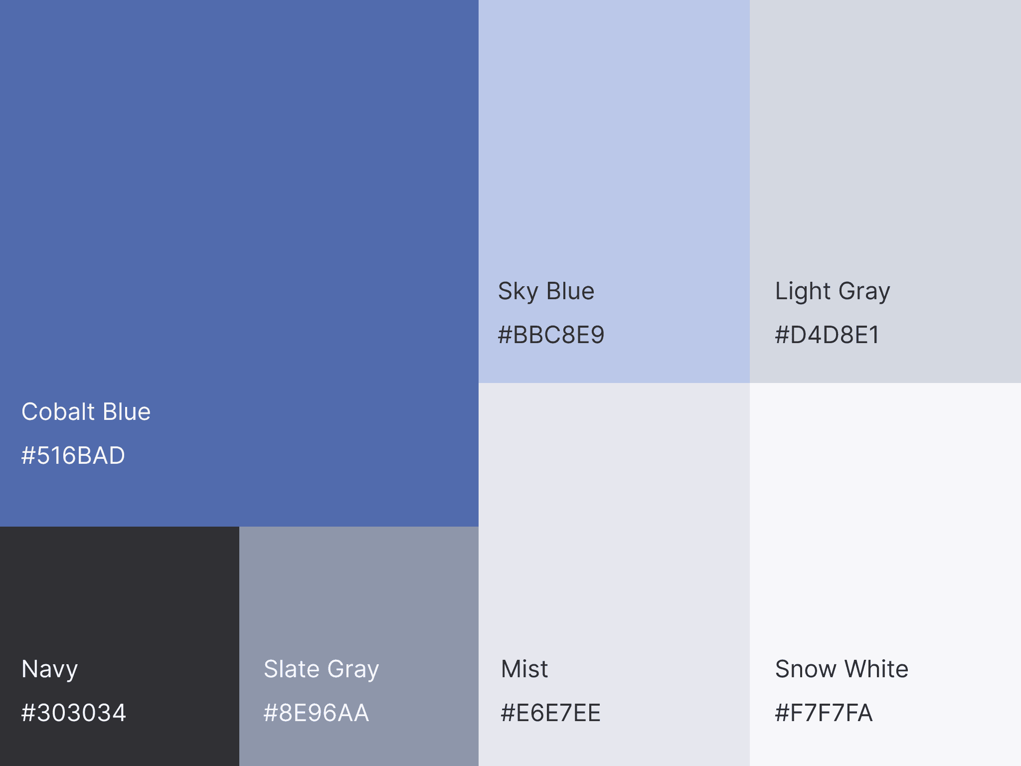
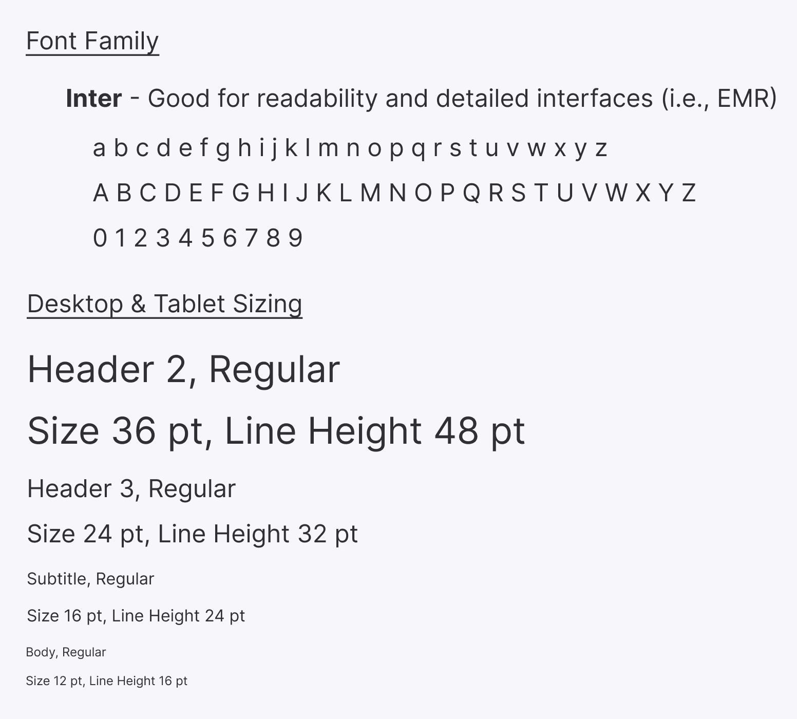
EMR UI should be easy to read, have a good information hierarchy, and a neutral color palette that does not distract attention away from its content.
Solution(s)
Patient Portal
Regardless of technical literacy/proficiency, patients should be able to easily view and interact with information relevant to them.
Since the patient portal is less information-heavy and more task-based, it makes sense for it to have a more clean and spacious aesthetic.

EMR System
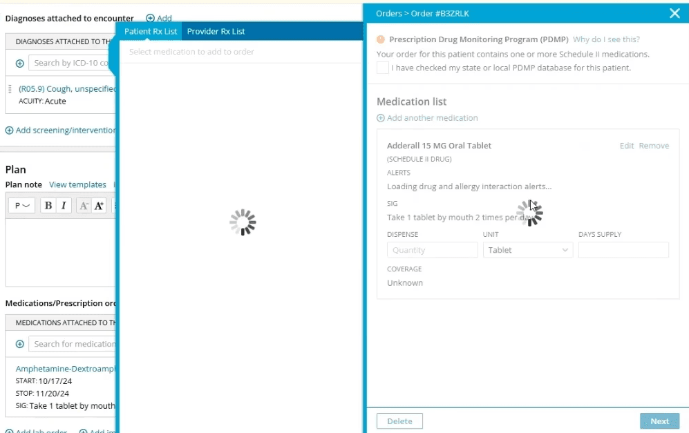
See Industry Example
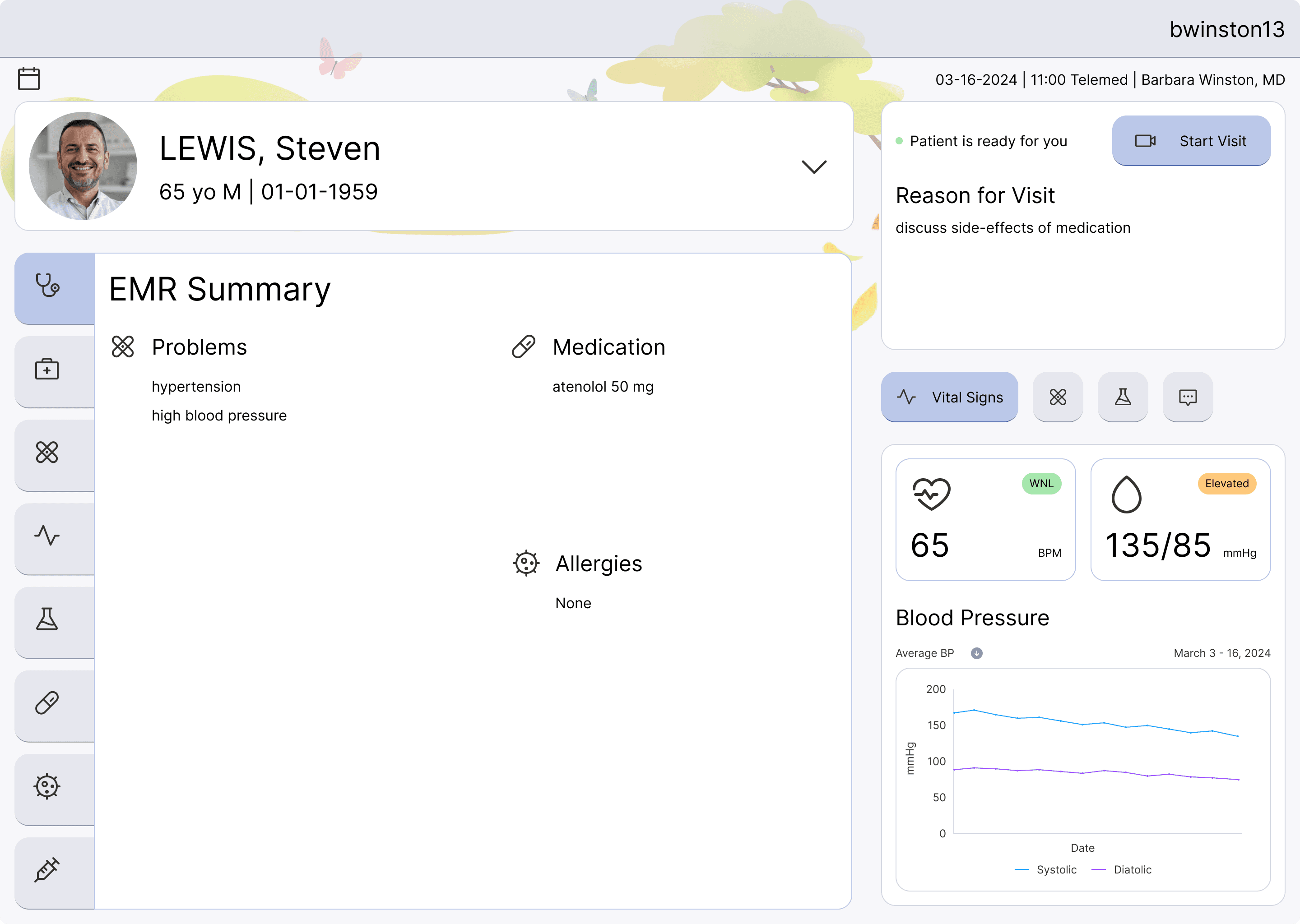
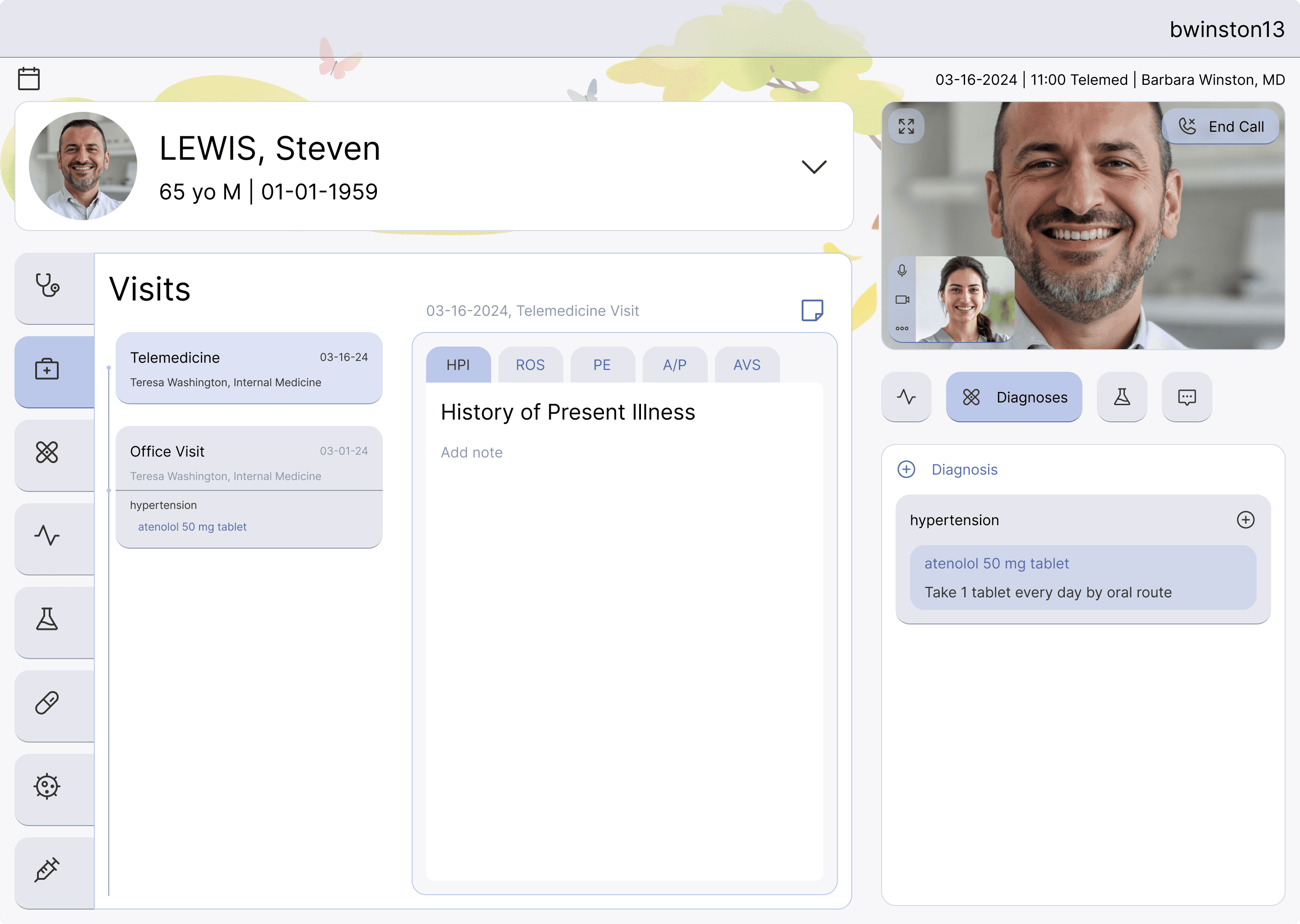
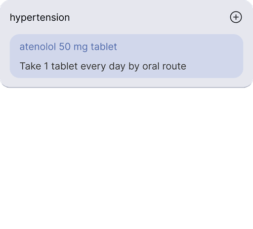
Chart functionality should not be forgone: Physician can interact with the patient chart as normal while on the video call.
No new pop-up windows. Just click and edit in place.
How I Would Test
If I were to test this solution, I would first make a clickable prototype and recruit both types of users (patients and physicians). I would run either a usability test or an A/B test, if not both, for each respective user flow.
I would take note of the following success metrics:
Points of confusion
Time it takes to complete task(s)
Number of clicks or misclicks